


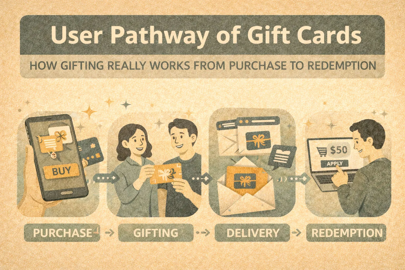
A gift card is not a product in the traditional sense, but a sequence of steps a user must successfully complete to unlock its value. This is why the concept of a user pathway describes the gift card experience more accurately than abstract user journeys or user flows. In practice, the pathway most often breaks during gifting, activation, rule comprehension, or when dealing with leftover balances. Users expect a simple, frictionless gift, yet frequently encounter hidden complexity and cognitive load. In this article, we analyse the gift card user pathway using Amazon Gift Card as a reference point and compare it with other popular alternatives in the US market.
What is a user pathway and why it fits gift cards better than classic user journey
A user pathway describes the actual sequence of actions a person goes through to reach a concrete outcome. In simple terms, it is the real-world path from intent to value, including pauses, confusion, workarounds, and drop-off points. Unlike abstract models, a user pathway focuses on what users actually do, not what a system assumes they should do.
This is where it differs from classic UX concepts. A user journey map typically visualises emotions, motivations, and touchpoints across a broader experience, often at a high level. A user flow, by contrast, focuses on interface logic: screens, decisions, and system states. Both are useful design tools, but neither fully captures the lived experience of a gift card. Gift cards are not exploratory or cyclical; they demand completion. Either the value is redeemed, or it is partially lost.
Gift cards therefore form a largely linear pathway: selection, purchase, delivery, activation, redemption, and balance resolution. Each step depends on the successful completion of the previous one. This linearity makes the experience easy to describe, but also fragile. A single point of friction — an unclear email, a failed activation, a confusing balance rule — can break the entire pathway and turn a well-intentioned gift into frustration.
This is also where the distinction between user journey and customer journey becomes relevant. Customer journeys often include marketing touchpoints, brand perception, and long-term relationships. Gift cards, however, frequently involve two users with different goals: the buyer and the recipient. The buyer’s journey may end at checkout, while the recipient’s pathway has only just begun. Analysing gift cards through a user pathway lens makes this handoff visible and exposes risks that traditional journey maps often smooth over or ignore.
In short, gift cards are not about exploration or engagement over time. They are about successfully transferring value through a narrow path with little tolerance for error. That is precisely why user pathway is the most accurate and practical framework for analysing their UX.
The gift card as a UX object, not a financial product
Most users do not perceive a gift card as a financial instrument. They see it as a simple, low-risk present — a substitute for cash that requires less thought, less explanation, and less responsibility. The expectation is clear: buy it, send it, and let the recipient decide what to do with it. From a user’s perspective, the value of a gift card lies in its effortlessness, not in its financial mechanics.
The reality is very different. Gift cards are governed by terms, conditions, regional limitations, balance rules, and platform-specific interfaces. Activation steps, expiry clauses, usage exclusions, and partial redemption logic are all part of the system, yet rarely visible at the moment of purchase. These constraints turn what appears to be a simple object into a layered UX artefact that spans emails, account dashboards, checkout flows, and support pages.
Users rarely read the rules because the product framing actively discourages it. Gift cards are sold as intuitive, friendly, and “safe” gifts. The cognitive model is emotional, not analytical. When the design signals simplicity, users assume there is nothing important to verify. Any complexity discovered later feels like a breach of expectation rather than a neutral rule set.
This is where trust and brand play a decisive role. Well-known platforms benefit from an implicit trust transfer: users assume the system will “just work” because the brand usually does. Amazon, for example, is rarely questioned at the moment of purchase, while lesser-known or generic prepaid cards trigger more hesitation. Trust reduces perceived risk, but it also masks UX debt. When something goes wrong, the emotional drop is steeper precisely because the brand promised effortlessness.
Viewed through a UX lens, a gift card is not money and not merely a product. It is a promise of simplicity that must be continuously upheld across multiple interfaces and moments. When that promise breaks, users do not blame themselves for missing the rules — they blame the experience.
Gift card is not money and not merely a product. It is a promise of a moments
User pathway stage 1: choosing a gift card
Amazon vs Visa vs brand gift cards
At the choice stage, users typically decide between three categories of gift cards:
- Amazon Gift Card — ecosystem-based, extremely broad in use, no fees, no expiry, high perceived safety
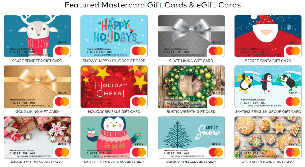
- Visa / Mastercard Gift Cards — network-based, usable across many merchants, but often involve activation steps, fees, and online payment friction
- Brand-specific gift cards — Walmart, Target, Apple, Google Play, Starbucks, Uber, Netflix, Best Buy — limited to one ecosystem but cognitively simple
Amazon’s advantage at this stage is not variety alone, but decision reduction. “It works for almost anything” is a powerful mental shortcut that collapses comparison effort.
Cognitive load at the decision point
Choosing a gift card requires users to predict another person’s future preferences. This already creates cognitive strain. Every additional rule, limitation, or category increases hesitation. Universal-sounding cards reduce this load, while prepaid network cards often increase it due to uncertainty around acceptance, fees, and technical compatibility.
From a user flow perspective, fewer questions equal faster progression. Amazon and major retailers minimise decision branches; generic prepaid cards multiply them.
Digital vs physical gift cards
Digital gift cards are favoured for speed and convenience. They remove delivery uncertainty but introduce risks related to email delivery, spam filtering, and accidental loss. Physical cards feel more “gift-like” and tangible, but add friction through shipping, timing, and potential loss.
The choice here reflects context, not preference: urgency pushes users toward digital, while ceremonial gifting favours physical.
Corporate gifting vs personal gifting
Corporate gifting prioritises predictability, bulk purchase, and low failure rates. Amazon and large retailers dominate this space due to standardisation and minimal support overhead. Personal gifting is more emotionally driven and tolerates slightly more friction if the gift feels thoughtful.
In both cases, the optimal user pathway at this stage reduces ambiguity. The less a user has to think about downstream consequences, the more likely they are to proceed.
User pathway stage 2: purchasing and checkout experience
Payment friction at checkout
At this stage, the user expects a fast and predictable transaction. Any deviation — forced account creation, repeated confirmations, unexpected verification steps — introduces friction. Gift cards are often bought under time pressure, which makes tolerance for delays especially low. A smooth checkout flow directly supports pathway completion; even minor obstacles increase abandonment.
Regional and payment restrictions
Despite their “universal” positioning, many gift cards are constrained by region, currency, or payment method. Some cards cannot be purchased from abroad, others reject non-local cards or specific funding sources. These restrictions usually surface late in the flow, creating frustration after the user has already committed effort. From a user experience flow perspective, late-stage rejections are among the most damaging interruptions.
Instant delivery vs delayed delivery
Instant delivery is a core expectation for digital gift cards. When delivery is delayed due to fraud checks, processing windows, or manual review, the perceived value drops sharply. Users rarely interpret delays as security measures
User pathway stage 3: gifting and transfer of value
Delivery channels: email, message, physical card
Gift cards are transferred through three main channels: email, messaging apps, or physical cards. Email remains the default for digital delivery, but it competes with spam filters, inbox overload, and delayed discovery. Messaging apps feel more immediate and personal, yet often lack formal structure and can be easily lost in chat history. Physical cards provide clarity and presence, but introduce risks related to timing, logistics, and loss.
Loss, forgotten codes, and spam filtering
This stage is where value becomes vulnerable. Codes can be misplaced, buried in inboxes, or accidentally deleted. Spam filtering is a frequent failure point for digital cards, especially for first-time recipients. From a user pathway perspective, the system assumes reliable transfer, while real behaviour proves otherwise. Any missing or unclear recovery path increases anxiety and support dependency.
The social moment of gifting
Gifting is not a technical action; it is a social interaction. Users care about how the gift is received, not just whether it works. Poor presentation, delayed delivery, or awkward redemption instructions can undermine the emotional intent of the gift. Even a functional card can feel disappointing if the moment of giving is compromised.
Emotional UX: joy versus anxiety
This stage carries the highest emotional contrast. When delivery is smooth and immediate, users experience relief and satisfaction. When something feels uncertain — no confirmation, unclear instructions, missing codes — anxiety replaces joy. Effective gift card UX reduces emotional risk by making the transfer of value visible, confirmed, and easily recoverable.
User pathway stage 4: activation and first use
First real contact with the system
Activation is the moment when the recipient stops being a passive holder of value and becomes an active user of the platform. This is often the first direct interaction with the system itself, not the brand promise. Any confusion here immediately reframes the gift from “easy” to “work”. From a UX standpoint, this is a critical trust checkpoint.
Code entry, accounts, and forced registration
Most gift cards require some form of code entry, but the surrounding requirements differ significantly. Amazon allows users to redeem codes directly into an existing or newly created account with minimal friction. Apple tightly couples activation to an Apple ID, making the pathway smooth for existing users but rigid for outsiders. Visa and Mastercard gift cards frequently introduce the most friction: external portals, balance registration, address matching, and unclear next steps.
Mandatory account creation is a common drop-off trigger. Users do not expect administrative tasks when redeeming a gift, and forced registration often feels disproportionate to the perceived value.
Typical errors and non-obvious steps
Common failure points include mistyped codes, unclear redemption pages, hidden regional limitations, and confusion about where the balance can actually be used. Error messages are often technical rather than explanatory, pushing users into trial-and-error behaviour. These issues rarely appear in journey maps but dominate real user experience.
Amazon, Apple, and Visa compared
Amazon’s activation flow benefits from ecosystem integration and clear balance visibility. Apple’s flow is efficient within its closed environment but less forgiving outside it. Visa gift cards suffer from fragmented UX, inconsistent rules, and low predictability across merchants. The contrast highlights a key insight: activation UX succeeds when it feels like continuation, not initiation.
At this stage, the user pathway either stabilises or collapses. If activation feels effortless, users move forward with confidence. If it feels bureaucratic, the gift begins to feel like a burden rather than a benefit.
User pathway stage 5: redemption, balance, leftovers
Partial redemption as the default case
Most gift cards are not used in a single transaction. Users apply part of the balance, expect the remainder to stay available, and assume future use will be effortless. This expectation often clashes with reality. Partial redemption introduces complexity: tracking balances, understanding minimum spend rules, and predicting whether the remaining amount is practically usable.
Leftover balances and cognitive friction
Small residual balances are a classic UX failure. Users know the value exists but struggle to apply it meaningfully. The effort required to monitor, remember, and optimise the remainder often outweighs the perceived benefit. Over time, this leads to abandonment, not because the pathway is blocked, but because it no longer feels worth completing.
Expiry anxiety and uncertainty
Even when gift cards legally do not expire, users frequently believe they might. Unclear messaging, regional rules, or past experiences with expiring credits create persistent anxiety. This uncertainty affects behaviour: users rush purchases, avoid partial use, or disengage altogether. From a UX perspective, perceived expiry is almost as harmful as real expiry.
“The money exists, but spending it is hard”
This is the final breakdown point of many gift card pathways. Technical availability does not equal practical usability. Restrictions on categories, payment combinations, or checkout compatibility turn stored value into a constraint rather than a benefit. User journey testing consistently shows that unresolved leftovers damage trust more than earlier friction, because the system has already promised ownership.
At this stage, the user pathway rarely ends cleanly. The remaining value either dissolves into inactivity or becomes a source of ongoing irritation — a quiet failure that most journey diagrams never capture.
Where most gift card user pathways break
- Expectation versus reality mismatch. Gift cards are marketed as simple and flexible, but the actual experience often introduces rules, constraints, and edge cases. This gap between expectation and reality creates frustration precisely because users did not anticipate complexity. When effort appears after the promise of simplicity, trust erodes quickly.
- Weak information architecture. Critical information is frequently fragmented across emails, help pages, and secondary screens. Users are forced to search for answers instead of being guided. Poor information hierarchy makes rules feel hidden, even when they are technically available. In linear pathways like gift cards, missing context at any step can break momentum.
- Lack of feedback and confirmation. Users need reassurance that value has been successfully transferred, activated, and preserved. Many systems fail to provide clear confirmations or status updates. Uncertainty about whether a code worked or a balance remains available increases cognitive load and support requests.
- Why universal cards often underperform. So-called universal gift cards promise flexibility but often deliver inconsistency. Acceptance varies by merchant, online payments fail unexpectedly, and balance handling is opaque. The pathway becomes unpredictable, which is the opposite of what users want from a gift.
Amazon Gift Card as a reference user pathway
The core value of Amazon Gift Card as a reference user pathway is not that Amazon designed a better gift card, but that it largely removed the concept of a gift card from the user’s mental model.
The professional insight is this: Amazon Gift Card succeeds because the user pathway does not feel like a separate scenario. It is fully embedded into an already familiar shopping flow. The user is not “activating a gift card” or “managing stored value” — they are simply continuing to shop. That distinction is critical.
Unlike Visa, Apple, or many brand-specific cards, Amazon does not introduce a new interface, a parallel system, or a special set of behaviours. Redemption becomes an invisible step rather than an explicit task. Balance application is automatic, transparent, and persistent, which eliminates decision points and reduces cognitive load.
Amazon’s strength is not feature richness but pathway compression. The fewer moments where users must consciously think about the gift card, the more successful the experience becomes. In this sense, Amazon Gift Card functions less as a financial instrument and more as a seamless extension of the core product ecosystem — and that is what makes it a useful reference model rather than just a popular option.
- User pathway feels shorter. Amazon’s gift card experience compresses multiple steps into familiar interactions. Users already understand the environment, so fewer explanations are needed. The pathway feels shorter not because it has fewer steps, but because each step aligns with existing mental models.
- Decision minimisation. Amazon removes choice overload by limiting variability. There are fewer rules to interpret and fewer alternative paths to consider. This keeps the user flow focused and reduces hesitation at every stage.
- Balance transparency. Balance visibility is constant and central. Users always know how much value remains and where to find it. This clarity prevents anxiety and encourages continued use, even with partial balances.
- The ecosystem effect. The strongest advantage lies in ecosystem integration. Gift cards function seamlessly across products, subscriptions, and services within the same platform. From a user flow in UX perspective, Amazon succeeds by making redemption feel like a continuation of normal shopping behaviour rather than a separate process.
Gift cards through a UX lens: journey map vs real behaviour
From an expert perspective, gift cards expose a common weakness in journey mapping practice. Journey maps often look clean, logical, and emotionally coherent on paper. They assume rational progression, clear handoffs, and ideal conditions. Real behaviour is messier. Users forget, misinterpret, delay, abandon, and return under different emotional states.
The gap appears because journey maps usually describe how the system is designed to work, not how value is actually recovered over time. Gift cards involve long pauses, secondary users, and delayed intentions — patterns that diagrams rarely capture. The result is a polished artefact that performs well in workshops but poorly in lived experience.
UX teams also tend to underestimate “silent failures”. Leftover balances, unredeemed codes, and minor friction rarely generate complaints, yet they define whether the pathway truly succeeds. These failures do not show up in conversion funnels or NPS surveys, but they shape long-term trust and perceived fairness.
In gift card UX, the most important behaviours happen between touchpoints, not within them. That is why journey mapping alone is insufficient.
Practical UX takeaways for designers and fintech teams
Design gift cards as pathways, not features. Each step must assume low attention, emotional context, and delayed use. Optimise for continuity, not completion.
Simplify first where users least expect complexity: gifting, activation, and balance handling. If something requires explanation, it is already too complex for a “simple gift”.
Measure what actually matters. Completion rate over time, partial redemption follow-through, balance decay, and recovery success are more meaningful than NPS. Satisfaction scores rarely reflect hidden friction.
Use user pathway analysis as a reality check. It forces teams to follow value across time, devices, and users. Unlike abstract journey maps, pathways reveal where experience quietly breaks — and where trust is either earned or lost.


