

The comparison of gen z vs gen alpha characteristics has shifted from a demographic discussion to a UX problem. Product teams are no longer struggling to “appeal” to younger users — they are struggling to understand why interfaces that feel intuitive to Gen Z already fail to engage Gen Alpha. This is not a matter of visual style or content tone. It is a structural mismatch between how products are designed to be used and how the next generation expects digital systems to behave.
Gen Alpha is not simply a younger version of Gen Z. While Gen Z grew up learning how to use digital tools, Gen Alpha grows up inside digital environments that operate continuously in the background. Search, menus, onboarding flows, and even explicit choices are no longer perceived as helpful guidance — they are experienced as friction. This creates a fundamentally different user type, shaped less by interaction skills and more by delegated decision-making and system-driven outcomes.
The first signs of this mismatch are already visible. Products optimised for clarity, comparison, and user control perform well with Gen Z but feel slow, demanding, or unnecessarily complex to Gen Alpha. Interfaces that assume learning, exploration, or conscious navigation begin to break when users expect immediacy, automation, and invisible logic. This is where UX design starts to fail — not because it is poorly executed, but because it is built on assumptions that no longer hold.
Generation Alpha meaning: why Gen Alpha is not just “younger Gen Z”
To define Gen Alpha accurately, age is the least useful starting point. The generation alpha meaning is shaped primarily by the environment in which interaction happens, not by when users were born. Gen Alpha is the first cohort to grow up inside fully mediated digital ecosystems where platforms anticipate needs, filter options, and operate continuously without explicit user input. Their behaviour is a product of systems that decide first and ask later.
This is the core difference in what defines generation alpha. Gen Z entered digital space through opt-in use: logging in, searching, choosing platforms, and learning interfaces over time. Gen Alpha, by contrast, is surrounded by always-on platforms from the start. Content is pre-selected, devices are shared or managed, and interaction often happens through simplified layers designed to remove complexity rather than expose it. The system adapts to the user, not the other way around.
Because of this, the term “digital native” no longer captures the reality. Gen Z learned to navigate digital tools; Gen Alpha assumes digital mediation as the default state. There is no clear boundary between online and offline interaction, and no expectation that understanding an interface is part of the user’s responsibility. Functionality is expected to be immediate, contextual, and largely invisible.
In short, gen z and gen alpha begin from fundamentally different starting conditions. Gen Z developed agency through exploration and choice. Gen Alpha develops reliance through automation and curation. Treating Gen Alpha as a younger Gen Z ignores the environmental shift that defines how they experience digital products — and why UX assumptions built for Gen Z no longer translate.
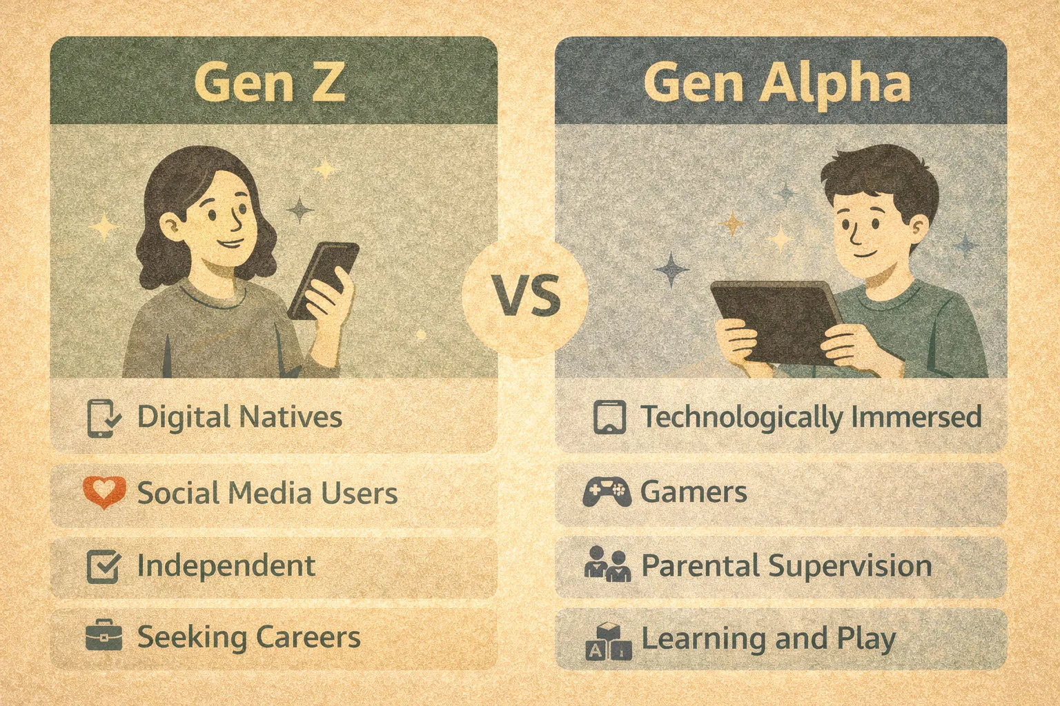
Gen Z vs Gen Alpha characteristics: a UX-first comparison
A meaningful comparison of gen z vs gen alpha characteristics begins with how responsibility is distributed between the user and the system. Gen Z users are accustomed to making decisions: selecting options, comparing alternatives, and actively navigating interfaces. UX for Gen Z assumes participation. Gen Alpha, in contrast, expects delegation. Systems are meant to decide, filter, and sequence content automatically, with minimal visible input.
This difference is clearly visible in interaction patterns. Gen Z relies on search-driven UX — typed queries, filters, lists, and explicit controls. Gen Alpha grows up in feed-driven environments where discovery is passive and continuous. Content appears without being requested, and relevance is inferred rather than defined. Asking a Gen Alpha user to search is not empowering; it introduces unnecessary effort.
Tolerance to friction further separates the two groups. Gen Z accepts short onboarding flows, permissions, and contextual explanations if they lead to better control or understanding. Gen Alpha has almost no tolerance for setup or learning. Any requirement to “figure out” how a system works is perceived as failure. Interaction is expected to be immediate and self-explanatory, without instruction.
This also shapes how errors are perceived. Gen Z expects feedback, error states, and recovery paths. Gen Alpha expects systems to prevent errors entirely. When something goes wrong, it feels less like a mistake and more like a broken promise. The interface is expected to behave “magically” — not in the sense of novelty, but in the sense of predictability without visibility.
This is why the difference between gen z and gen alpha is not a matter of taste or aesthetics. It is a UX gap rooted in cognitive expectations. Interfaces designed to support agency, learning, and control work for Gen Z. The same interfaces feel slow, demanding, or unnecessary for Gen Alpha, whose baseline expectation is automated support rather than interaction.
Generation Z and Generation Alpha: how interaction models already diverge
The divergence between generation z and generation alpha is already visible in how digital products are interpreted. Gen Z treats interfaces as tools — means to achieve specific goals. They expect structure, options, and the ability to intervene. Even when automation is present, control remains central to their mental model.
Gen Alpha treats interfaces as environments. Interaction is not goal-oriented in the same way; it is contextual and ongoing. The system is not something to operate, but something to exist within. Content, functionality, and feedback blend into a continuous experience rather than discrete steps.
This shift exposes the limits of traditional journey mapping. Journey maps assume intentional movement from one step to another, with clear entry points, decisions, and outcomes. For Gen Alpha, these boundaries often do not exist. Interaction is non-linear, interrupted, and mediated by systems that adapt in real time. Mapping a “journey” where no conscious navigation occurs can produce diagrams that look coherent but describe behaviour that never actually happens.
What UX teams often underestimate is how deeply these interaction models affect expectations. Simplifying interfaces is not enough. Reducing buttons or shortening flows does not address the underlying assumption that the user wants to engage with the interface at all. For Gen Alpha, the most successful UX is often the one that removes itself — operating quietly in the background while maintaining trust and consistency.
Case study: Amazon Kids+ as a Gen Alpha–native UX environment
Amazon Kids+ is useful as a case study not because of its content library, but because of what it deliberately removes from the user experience. The service is designed around the assumption that the primary user should not need to understand, configure, or navigate a system in order to use it. From a UX perspective, this makes it one of the clearest examples of a Gen Alpha–native environment.
The most significant removal is explicit choice architecture. Amazon Kids+ does not ask users to search, compare, or decide what to do next. Options are limited, pre-filtered, and presented as immediately actionable content. There are no visible decision trees, no sense of “correct” navigation, and no requirement to evaluate alternatives. Interaction is reduced to selection rather than choice.
This leads to a content-first, not navigation-first design. The interface is organised around surfaced content, not around menus or hierarchies. Movement through the system happens by consuming what is presented rather than by actively seeking something else. For Gen Alpha users, this aligns with expectations formed by algorithmic feeds and continuous recommendation. The interface feels responsive without demanding attention.
Onboarding is almost entirely invisible. There is no learning curve in the traditional sense, because the system does not require learning. Controls are minimal, feedback is immediate, and interaction patterns repeat consistently. The absence of explicit instruction is not a gap — it is the design itself. The system assumes that if something needs to be explained, it has already failed.
This approach works precisely because it matches Gen Alpha characteristics: low tolerance for friction, reliance on system mediation, and an expectation of immediate usability. For Gen Z users, however, the same design can feel over-simplified or restrictive. The lack of search, filters, or deeper control reduces agency. What feels intuitive to Gen Alpha may feel limiting to Gen Z, not because it is poorly designed, but because it is optimised for a different interaction model.
Amazon Kids+ demonstrates a critical UX shift. Success for Gen Alpha does not come from simplifying existing interfaces, but from removing the assumption that users want to operate an interface at all.
Parental mediation as a UX layer (and why Gen Z didn’t need it)
One of the most overlooked differences between gen z and alpha is the presence of a third actor in the user experience: the parent. In Gen Alpha–oriented products, the parent is not an external stakeholder but an integral part of the interface logic. Controls, permissions, and boundaries are designed to be invisible to the child while remaining fully accessible to the adult. This creates a layered UX in which different users interact with different versions of the same system.
Trust and safety are not negotiated by the primary user. They are delegated. Content filtering, time limits, and access rules operate as background constraints rather than visible choices. For Gen Alpha, safety is not something to manage or understand; it is something the system guarantees by default. This is a sharp contrast to generation z vs alpha dynamics, where Gen Z users were expected to learn platform rules, manage privacy settings, and interpret risk signals themselves.
This shift has implications for UX metrics. Traditional indicators such as task completion, discoverability, or even satisfaction surveys capture only part of the experience. For Gen Alpha products, success is often measured indirectly: reduced intervention, fewer breakdowns, and sustained engagement without friction. The absence of problems becomes a stronger signal than explicit positive feedback.
As a result, Gen Alpha grows up inside controlled ecosystems that feel seamless rather than restrictive. Boundaries exist, but they are rarely visible. Unlike Gen Z, which developed digital literacy through exposure and trial-and-error, Gen Alpha develops trust through consistency and protection. UX design here is less about teaching users how to behave and more about ensuring the system behaves predictably on their behalf.
Micro-example: Alexa and voice-first UX for Gen Alpha
Voice interaction highlights the contrast between gen z versus gen alpha particularly clearly. For Gen Alpha, voice is not an accessibility feature or a convenience layer — it is a default interaction mode. Speaking to a system requires no interface learning, no reading, and no navigation. The system responds in the same modality in which the request is made, reinforcing a sense of immediacy.
Gen Z typically uses voice to execute specific tasks: setting timers, controlling music, checking the weather. Voice is instrumental. It complements screen-based interaction but rarely replaces it. The user remains aware of issuing a command to a tool.
Gen Alpha uses voice to interact. Requests are exploratory, conversational, and sometimes ambiguous. The expectation is not precise execution but contextual understanding. Errors are less tolerated, because spoken interaction implies comprehension rather than instruction. This is why conversational UX feels natural to Gen Alpha: it removes the visible interface entirely and replaces it with dialogue, aligning with an environment-based mental model.
Voice-first systems expose a broader shift in UX expectations. As users move from gen z to gen alpha, interaction moves away from command-and-response patterns toward systems that are expected to interpret intent without explicit structure.
Micro-example: Fire Tablet Kids vs standard Fire Tablet
The difference between generation z vs generation alpha becomes especially clear when comparing Fire Tablet Kids with the standard Fire Tablet. Both devices share the same hardware, but their UX philosophies are fundamentally different.
The standard Fire Tablet is designed around navigation depth. Menus, settings, app management, and discoverability assume that users want control and are willing to invest effort to configure their experience. This aligns with Gen Z expectations, where exploration and customization are part of digital competence.
Fire Tablet Kids prioritises content immersion. Navigation is shallow, options are constrained, and the interface surfaces what can be used rather than what can be configured. There is no sense of “mastering” the device. The experience is immediate and repeatable, with minimal variation in interaction patterns.
This contrast points to a broader implication for future product design. As Gen Alpha becomes a primary user group, successful products may increasingly separate capability from control. Systems will remain powerful, but the visible interface will continue to shrink. What matters is not how much a user can do, but how little they need to understand in order to do it.
Where UX designed for Gen Z breaks for Gen Alpha
UX patterns built for Gen Z often fail for a generation younger than Gen Z because they rely on assumptions that no longer hold. The first is the assumption of conscious choice. Many interfaces expect users to evaluate options, understand trade-offs, and intentionally decide what to do next. For Gen Alpha, this expectation introduces friction rather than empowerment. Decision-making is experienced as effort, not agency.
The second broken assumption is comparison behaviour. Gen Z users are comfortable scanning lists, comparing features, and optimising outcomes. Gen Alpha users are less inclined to compare at all. When faced with multiple similar options, the interface does not feel rich — it feels unresolved. Systems that ask users to choose between equivalent alternatives create uncertainty instead of confidence.
A third failure point is the assumption of interface learning. Gen Z accepts that digital products require a brief learning phase. Gen Alpha expects immediate usability without explanation. Tutorials, tips, or progressive disclosure are often ignored or bypassed. If the interface requires learning, it is perceived as poorly designed, regardless of its objective simplicity.
This is why simply “simplifying UI” is not enough. Removing buttons or shortening flows does not address the underlying expectation that the user should engage with the interface at all. For Gen Alpha, the most effective UX reduces visible interaction, not visual complexity. Design breaks when effort is shifted back onto the user, even in subtle ways.
What comes after Gen Alpha — and why it matters now
Questions such as what is after Gen Delta or what is after generation Delta reflect a common desire to categorise future users linearly. From a UX perspective, this framing is misleading. Generational boundaries matter less than environmental shifts. Designing for “the next generation” assumes continuity, when the actual change is structural.
The more relevant trend is the movement from interfaces to environments. Digital products are becoming less about explicit interaction and more about continuous mediation. Systems observe, predict, and act without waiting for user input. In this context, autonomy gradually shifts from the user to the system. Control is not removed, but it becomes abstracted and delegated.
This matters now because these patterns are already visible. Gen Alpha is not a distant future cohort; it is actively shaping expectations that will influence mainstream UX within a few years. Waiting for a clearly defined “next generation” risks missing the transition already underway.
Practical UX takeaways: designing for Gen Z and Gen Alpha at the same time
Designing for gen z vs gen a does not mean choosing one group over the other. It requires recognising when different interaction models should coexist. Choice should be preserved when users benefit from understanding and control — particularly in financial, creative, or high-stakes contexts. Choice should be removed when it adds cognitive load without meaningful value.
Metrics also need to adapt. For Gen Alpha–oriented experiences, low error rates, reduced intervention, and sustained frictionless engagement often matter more than NPS. Satisfaction is implied through absence of breakdown rather than explicit feedback.
Finally, teams should avoid designing for “average users.” Gen Z or Gen Alpha users do not sit on a smooth continuum; they operate under different assumptions about responsibility, effort, and system behaviour. The most resilient UX strategies are those that allow systems to adapt — offering agency where it is expected and invisibility where it is preferred.


