


This article examines Amazon payments technology from a user experience perspective. Rather than ranking digital payment methods or promoting specific electronic payment services, the focus here is analytical: how users interact with payment technology inside the Amazon ecosystem, why this interaction feels almost invisible in daily use, and where hidden complexity and friction still exist.
Amazon is not just a large e-commerce platform. It operates as a living laboratory for digital payment systems, electronic payment methods, and new payment technologies that have become part of everyday routines. Payments on Amazon rarely feel like a separate action. They are embedded into browsing, decision-making, and fulfilment flows. This apparent simplicity, however, is the result of deliberate UX design choices, behavioural patterns, and trust mechanisms that deserve closer inspection.
At the same time, the very smoothness of this experience creates blind spots. Some aspects of digital payment services on Amazon remain opaque, cognitively compressed, or insufficiently explained to users. Exploring these tensions is where the research value lies.
Amazon as a digital payment ecosystem
From a UX standpoint, Amazon should be understood as a digital payment platform rather than a checkout interface. Payment technology on Amazon is not confined to a single screen or moment. It is distributed across accounts, devices, subscriptions, stored credentials, and background processes such as recurring billing or delayed charge capture.
Users rarely encounter a single, clearly defined “payment moment”. Instead, they interact with a layered digital payment system that brings together multiple electronic payment methods and payment technologies, including:
- stored debit and credit cards
- Amazon Gift Card balances and gift card redemptions
- co-branded payment instruments such as the Amazon Visa Card
- instalment and deferred payment options (for example, Pay over Time with Affirm or Pay Later programs backed by Synchrony)
- voucher and promotional code applications that alter the payable amount before confirmation
- eligible FSA or HSA cards for specific product categories
- US-based personal checking accounts connected via electronic funds transfer
- one-click confirmation flows that abstract payment selection entirely
- subscription and auto-renewal logic for recurring digital payments
- refunds, reversals, and partial reimbursements processed back through original payment routes
- account-level security, verification, and risk controls operating in the background
This distribution significantly reduces perceived effort and interaction cost for users. At the same time, it increases system complexity and reduces the visibility of how individual digital payment methods, electronic payment services, and payment technologies actually interact. As a result, the digital payment experience on Amazon becomes ambient rather than explicit — present everywhere, but rarely examined directly by the user.
Payment technology on Amazon
Onboarding and first-use experience
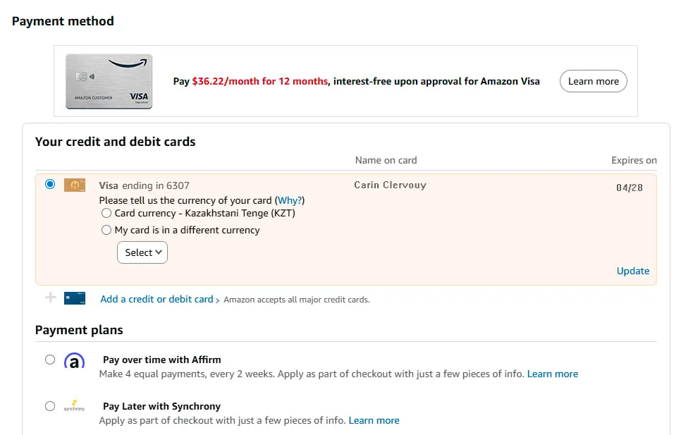
“When I first started using Amazon after moving to Los Angeles from Astana, I thought payments would be the easiest part. I had a Visa card, a US job, everything seemed straightforward. But the moment I reached the payment settings, I hesitated. Amazon asked me to confirm the currency of my card, and I realised I wasn’t completely sure how my card was being treated in the system. Was it still considered a foreign card? Would it convert automatically? Should I choose a different option?
Nothing was technically wrong, but the interface assumed I already understood how all of this worked. I clicked through, hoping I made the right choice. The payment went through, so I stopped worrying. Still, that first interaction made it clear that the system is designed for confidence and speed, not for explaining edge cases like relocating, mixed banking histories, or cards issued in another country.”
Carin C.
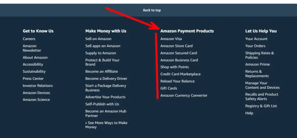
Amazone digital payments examples
Payment setup as a background task
During initial account creation, payment onboarding is intentionally lightweight. Users are asked to add a card or other electronic payment options early, often before a clear purchasing intent exists. From a UX perspective, this reframes payment setup as a prerequisite rather than a decision.
This approach reduces later friction but also compresses user understanding. Many users complete payment onboarding without fully processing:
- how payment methods are prioritised
- how changes propagate across subscriptions
- how refunds are handled across different digital payment services
The system relies on familiarity rather than explanation, which works well for experienced users but less so for those encountering digital payment technologies for the first time.

Amazon digital payment solutions
First successful payment as trust reinforcement
The first completed transaction acts as a behavioural anchor. Once a digital payment succeeds without visible issues, users tend to generalise that trust across future interactions. This pattern reduces scrutiny of later payment steps, even when flows change slightly.
Information clarity and cognitive load
“At first, everything seemed pretty straightforward with Amazon payments, but as I started using it more, I realised that some things weren’t as clear as I expected. For example, when I added my Visa card, there was an option to choose the currency, but I wasn’t sure if I needed to select the currency of my card or if Amazon would handle the conversion. The way they worded it made me second-guess myself. The question was simple, but it wasn’t explained clearly enough to avoid any confusion, especially for someone like me who’s not familiar with how foreign cards are handled in the US.
I clicked through and selected the option that seemed right, but even after completing the payment, I still wasn’t sure if I’d made the correct choice. I realised that, although the system is designed to make payments quick and easy, sometimes I’d prefer a bit more explanation to understand exactly how things work, especially when it comes to billing and currencies.”
Lourence H.
Minimalism over explanation
Amazon’s payment interfaces are visually sparse. This reduces cognitive load during checkout but shifts complexity elsewhere. Information about electronic payment methods, payment technologies in use, or billing logic is often hidden behind expandable sections or secondary pages.
Common patterns observed include:
- default selections that discourage exploration
- terminology that assumes prior knowledge
- confirmation screens that emphasise speed over clarity
From a research perspective, this creates a trade-off. The digital payment experience feels effortless, but user mental models may remain incomplete.
What users may not clearly understand
Despite frequent use, users often express uncertainty around:
- when exactly a charge is captured
- how split shipments affect billing
- how refunds interact with original digital payment methods
- how subscription changes impact future payments
These are not failures of the digital payment system itself, but of information timing and visibility.
Navigation and interface patterns
Unlike traditional electronic payment solutions, Amazon avoids dedicated “payment pages” during active use. Payments are embedded into flows such as:
- product detail pages
- checkout summaries
- order history
- account settings
Navigation reinforces the idea that payment is not a standalone action but part of a broader activity. This reduces friction but can make troubleshooting harder, as users may struggle to locate where payment logic is actually controlled.
Consistency across devices
One notable UX characteristic is consistency. Whether on desktop, mobile web, or app, digital payment methods are presented in structurally similar ways. This consistency supports user confidence and reduces relearning costs, especially important for a platform operating at global scale.
Trust signals and user confidence
“Over time, I stopped paying attention to the payment details altogether. Once a few orders went through without issues, I just trusted that Amazon knew what it was doing. I didn’t recheck the currency settings, I didn’t review which card was being charged, and I rarely looked at the confirmation screens in detail. The interface felt calm and familiar, so I assumed everything was under control. That trust wasn’t built because the system explained itself well, but because nothing went wrong often enough to make me question it. When something unusual did happen — a delayed charge or a refund that took longer than expected — I realised how little I actually understood about how payments worked. Until then, confidence came mostly from habit, not from clarity.”
Anthony B.
Familiarity as a trust mechanism
Trust in Amazon payments technology is rarely built through explicit messaging. Instead, it emerges through repetition and reliability. Users learn to trust the digital payment system because it usually works, not because it explains itself.
Subtle trust signals include:
- predictable confirmation language
- immediate order feedback
- visible order tracking linked to payment completion
- integrated refund notifications
These signals reinforce the perception of control, even when underlying processes remain abstract.
Security without visibility
Security measures such as fraud detection or verification checks are mostly invisible unless triggered. While this protects flow continuity, it can create confusion when exceptions occur. Users may not understand why a payment failed or why a verification step suddenly appeared.
This opacity is a recurring tension in payment technologies: balancing security with perceived transparency.
Common friction points and breakdowns
Even highly optimised digital payment platforms exhibit friction. On Amazon, these issues tend to surface not during standard checkout but at the edges of the system.
Subscription and recurring payments
Recurring digital payments often generate the most confusion. Users may encounter:
- unexpected charges after trial periods
- unclear renewal dates
- difficulty mapping subscriptions to original purchase decisions
The interface often prioritises management efficiency over explanatory depth, which can increase cognitive load during problem resolution.
Refund timing and expectations
Refunds illustrate a gap between system logic and user expectations. While the digital payment system may process refunds correctly, users frequently focus on:
- how long funds take to reappear
- whether refunds go to the original electronic payment method
- discrepancies between order status and bank statements
These moments expose the complexity of digital payment services that are otherwise hidden.
Behavioural patterns observed in real use
“I’ve been using Amazon for years, and I honestly don’t think about payments there anymore. I click ‘Buy now’ and assume everything will just work. Most of the time it does. But when I actually stop and think about it, I realise I’m not always sure what happens behind the scenes. Sometimes a charge appears later than I expect, sometimes an order is split into several payments, and refunds don’t always line up neatly with what I see in my bank account. None of this feels alarming, but it does feel vague. I trust the system because it rarely fails me, not because I fully understand it. The payment process has become so automatic that I only notice it when something breaks or behaves differently than my mental model.”
Zack M.
Reduced payment salience
One of the most significant behavioural outcomes is reduced payment salience. Users think less about paying and more about receiving. This is not inherently negative, but it reshapes how users perceive spending and accountability.
Habit formation through interface design
Repeated exposure to similar payment patterns builds habit. Over time, users stop evaluating digital payment methods actively. They rely on defaults, muscle memory, and platform trust.
From a UX research standpoint, this raises questions about informed consent and user awareness, especially as payment technologies become more automated.
Dark corners of an everyday payment system
The maturity of Amazon payments technology makes it feel domestic and routine, but this familiarity can mask important details. The system works so smoothly that users may not realise:
- how many payment technologies operate in parallel
- how decisions are automated
- how limited visibility can affect dispute resolution
These are not flaws unique to Amazon. They reflect broader trends in the digital payments industry, where convenience often outpaces explanation.
Conclusion
Amazon payments technology demonstrates how digital payment systems can become seamlessly embedded into everyday behaviour. Through careful UX design, electronic payment services are transformed from explicit actions into background infrastructure.
This analysis highlights both strengths and blind spots. The reduction of friction and cognitive load supports scale and efficiency, but it also compresses user understanding. As payment technologies continue to evolve, the challenge is not only to make payments faster or more invisible, but to preserve clarity, trust, and user agency.
This article is intended for informational and UX research purposes and does not constitute financial, product, or purchasing advice.
Updated 16/12/2025


