

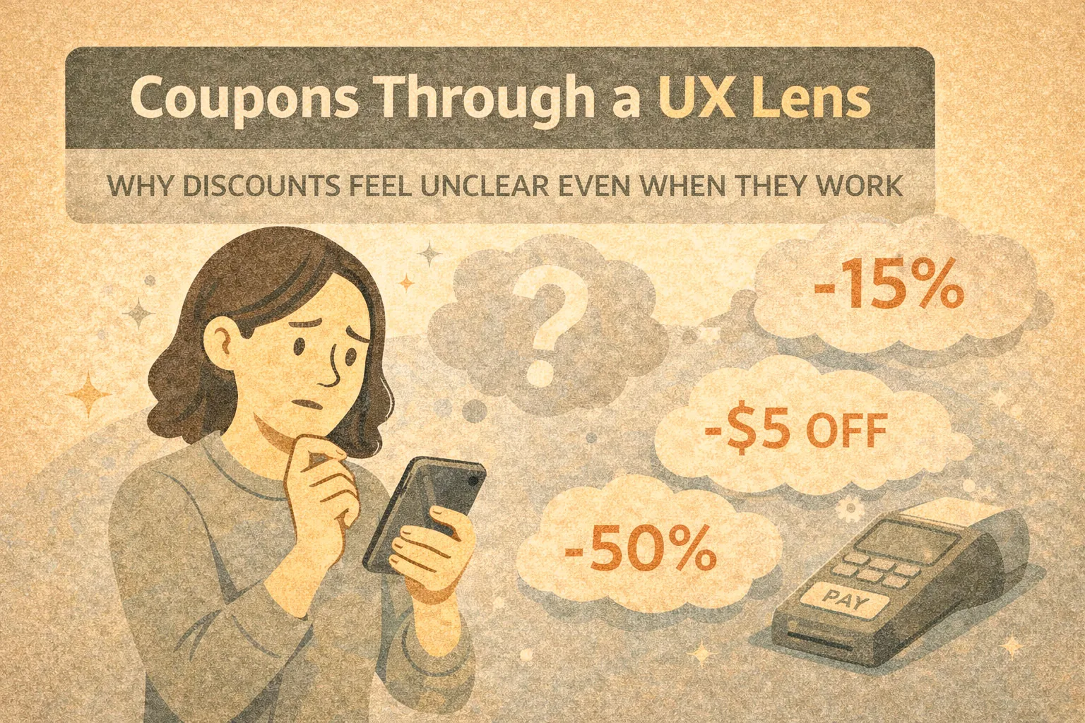
This article examines Amazon coupons from a user experience perspective. Rather than assessing whether coupons offer good value, the focus here is on how users encounter, interpret, and interact with coupon mechanics, and why these interactions often feel confusing despite being widely used.
Amazon’s coupon system is a useful case study in behavioural UX design: it is highly effective in driving engagement, yet frequently undermines clarity and trust.
Framing Amazon Coupons as a UX System
Amazon coupons are not simply price reductions. From a UX standpoint, they function as a distinct interaction layer added on top of the core pricing system, designed to influence attention, behaviour, and decision timing rather than transparently lower cost.
At a system level, Amazon coupons are created and funded by individual sellers, not by Amazon itself. They are time-limited, condition-based incentives that coexist with the listed price rather than replacing it. This separation is critical to understanding why coupons behave differently from traditional discounts.
From the user’s perspective, coupons appear as a visual benefit. From the system’s perspective, they are a conditional entitlement that must be manually activated and validated later in the flow.
Amazon Coupons Examples
Key characteristics of the system:
- coupons require an explicit user action (“clipping”) rather than applying automatically
- the advertised saving is detached from the displayed product price
- eligibility rules may depend on account status, subscription type, or region
- the actual price change is only confirmed at checkout
- coupons can expire, be withdrawn, or reach usage limits without advance notice
This architecture creates a gap between what users see and what the system guarantees. The coupon signals a potential saving, not a confirmed one.
As a result, coupons operate less like pricing information and more like behavioural prompts. They encourage engagement and progression through the funnel while shifting clarity and confirmation to later stages.
This combination shapes how users perceive savings, effort, and risk — often increasing motivation to continue, while simultaneously increasing uncertainty about the final outcome.
Onboarding and First-Use Experience
For first-time users, coupons introduce an immediate cognitive mismatch.
Observed patterns:
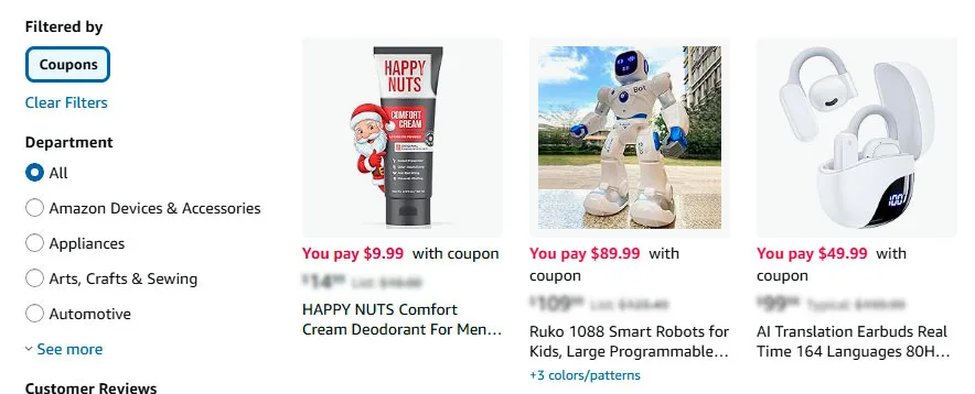
- users see a highlighted coupon badge and assume the price is already reduced
- the requirement to actively “clip” a coupon is not always perceived as mandatory
- there is no onboarding explanation of how coupons actually apply
The system assumes prior knowledge. Users who lack this mental model often proceed with incorrect expectations.

How users see a highlighted coupon badge on Amazon
Information Clarity and Cognitive Load
Coupons add an additional decision layer at a moment when users are already processing:
- product specifications
- reviews and ratings
- delivery options
- seller credibility
Common clarity issues:
- the discount amount is shown, but not the final effective price
- eligibility conditions are hidden behind small text
- timing of application is unclear until checkout
This increases cognitive load at precisely the point where Amazon usually optimises for speed.
Navigation and Interface Patterns
The “clip coupon” interaction is a central UX element.
From an interface perspective:
- it resembles a checkbox but behaves like a temporary entitlement
- there is no strong visual confirmation after activation
- the price displayed on the page remains unchanged
As a result, users must rely on memory and trust rather than visible system feedback. This is atypical for Amazon’s otherwise explicit interface conventions.
Example of Amazon Coupon Behaviour on a High-Priced Product
Coupon INAIR 2 Elite Suite — AI Spatial Computer OS AR Glasses with Pod and Keyboard
First scene: the green coupon checkbox in a product listing or compact preview
From a UX perspective, this element functions less as a discount indicator and more as an action trigger. The green colour, the phrasing “You pay $899.99 with coupon,” and the absence of any immediate commitment create a sense of low-risk benefit. The user has not purchased anything yet, but psychologically they have already “saved”.
This is where a micro-dopamine effect occurs. A potential reward is presented upfront, while the required effort is minimal — a single checkbox interaction. In the context of a high-priced product, the absolute saving feels substantial, even before the user fully processes the conditions.
At this stage, the coupon:
- increases click-through rate
- softens initial price shock
- creates an expectation of control over the final price
Crucially, there is no confirmation. What the interface offers here is a promise, not a result.

The green coupon checkbox in a product listing
Second scene: the coupon checkbox on the product detail page
The second state appears on the product page itself, where the coupon is shown as a red checkbox with more formal wording.
Here, the UX context changes. The user has already invested attention — reviewing images, specifications, and ratings. The coupon now acts less as a lure and more as a decision anchor. The red colour increases perceived urgency and importance: if the user does not activate it now, the benefit may be lost.
An important nuance is that the listed price remains high, while the coupon exists as a separate interface layer. This preserves the perceived value of the product while simultaneously creating a feeling of personal advantage — “it is expensive, but not for me”.
At this point, the micro-dopamine effect intensifies:
- the action feels deliberate
- the user experiences a sense of unlocking a benefit
- there is a subtle fear of missing out due to inaction
At the same time, the core UX issue remains: the outcome of the action is still not visible. The user must trust that the system will remember and apply the coupon later.

The “clip coupon” interaction is a central UX element
Why this matters in the UX of high-priced products
For expensive items, Amazon coupons serve a primarily psychological function rather than a purely financial one:
- they lower the entry barrier
- ease the moment of decision-making
- create a sense of active participation in price formation
This is not about savings as a fact, but savings as an experience.
From a UX research perspective, this is a powerful yet fragile pattern. It increases engagement and progression through the funnel, but repeated inconsistencies — disappearing coupons, unmet conditions, delayed application — can quickly erode trust.
That tension is precisely what makes Amazon coupons a compelling UX case study: an example of how micro-interactions and behavioural design can be highly effective while remaining only partially transparent to users.
Trust Signals and User Confidence
Coupons can unintentionally weaken trust signals.
Users frequently encounter situations where:
- a coupon disappears after page refresh
- a coupon is visible but not applied due to eligibility rules
- the final price only reflects the discount at the last step
Without clear explanations, these outcomes are often interpreted as errors rather than rules. Over time, this trains users to double-check carts and remain sceptical of displayed savings.
Common Friction Points and Breakdowns
Recurring UX friction includes:
- coupons limited to Prime users without prominent labelling
- conflicts between coupons and subscription-based discounts
- coupon exhaustion without status messaging
- different coupon visibility across user accounts
These issues are rarely framed as system logic within the interface, leaving users to infer meaning from absence rather than explanation.
Behavioural Patterns Observed in Real Use
Despite the friction, coupon usage persists because it activates several behavioural triggers:
- visual salience in search results increases click-through
- manual activation creates a sense of personal gain
- delayed reward reinforces completion of checkout
However, repeated exposure also creates learned behaviours:
- users routinely open the cart to verify prices
- some users ignore coupons entirely due to prior confusion
- others treat coupons as unreliable rather than beneficial
From a UX research standpoint, this reflects a trade-off between engagement and confidence.
Why Amazon Maintains This Design
The opacity of the coupon system appears intentional rather than accidental.
Likely reasons include:
- flexibility for sellers to test pricing without public price erosion
- behavioural nudging without long-term reference price changes
- scalability across millions of listings without user education overhead
The system prioritises behavioural efficiency over transparency.
UX Strengths and Weaknesses Summarised
| Strengths | Weaknesses |
|---|---|
| High visual discoverability | Low transparency |
| Strong behavioural activation | Delayed feedback |
| Minimal impact on perceived base price | Unclear rule communication |
| Erosion of user trust over repeated exposure |
Conclusion: Coupons as Behavioural UX, Not Price UX
Amazon coupons illustrate how discounts can function as behavioural design elements rather than clear pricing mechanisms. From a UX perspective, the system is effective but not user-friendly. It encourages action while withholding certainty.
Understanding this distinction helps explain why many users feel confused even when the coupon technically works as intended.
This article is intended for informational and UX research purposes and does not constitute financial, product, or purchasing advice.
Updated 16/12/2025


