


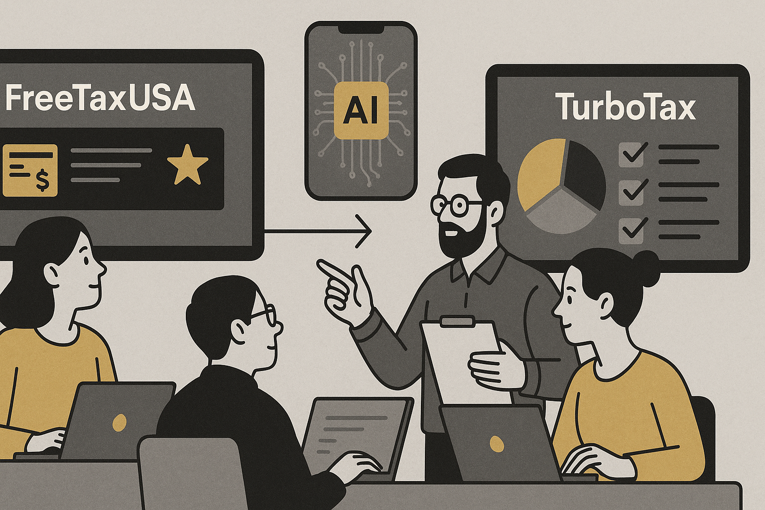
When tax season rolls around, millions of Americans face a critical UX decision—choosing the right digital tool to file their taxes. While FreeTaxUSA and TurboTax both promise simplicity and savings, the user experience (UX) they offer is starkly different. At FinUXlab, we examined these platforms not just as tax software, but as real-world case studies in UX design, conversion strategy, and digital trust-building. Here’s what we uncovered.
Core UX Strengths and Pain Points
Both platforms showcase clear UX philosophies, but they also highlight recurring friction points.
For TurboTax, the main challenge is the disruptive nature of its pricing model. Users often encounter unexpected paywalls deep into the filing process, which undermines trust. Additionally, while the conversational flow is effective for guidance, it can feel overly verbose or time-consuming for confident filers who prefer a more direct path.
FreeTaxUSA’s primary UX hurdle is discoverability—particularly in help systems and navigation affordances. The interface can feel dated, and users must know what to look for. However, it excels in transparency, speed, and pricing clarity. The absence of upsell surprises, combined with a reliable and minimalist design, makes it a best-practice example in building trust through consistency.
| Aspect | TurboTax – Best Practices | TurboTax – UX Drawbacks | FreeTaxUSA – Best Practices | FreeTaxUSA – UX Drawbacks |
|---|---|---|---|---|
| Onboarding & Guidance | Conversational interface mimics real-time interview, adapting to user responses. | Can feel slow or excessive for experienced users who prefer fast input. | Straightforward input forms for users with prior tax experience. | Limited guidance can confuse first-time filers or those unfamiliar with tax terms. |
| Pricing Experience | Polished funnel attracts users with \”Free Edition\” messaging. | Late-stage upgrade prompts cause friction and reduce trust. | Transparent pricing structure with clear fee disclosures up front. | Lack of in-product prompts to explain value of premium features. |
| Support & Help | Contextual help bubbles, live expert chat, AI-powered guidance. | Some support features gated behind higher-tier plans. | Robust knowledge base and basic live chat/email options. | Help resources are poorly surfaced and harder to discover in context. |
| Trust & Transparency | Strong brand equity, secure data handling reputation. | Perceived as overly commercial due to upselling tactics. | No hidden fees, minimal upsell attempts, user-first design philosophy. | UI feels outdated, which may impact perceived credibility. |
| Loyalty & Repeat Use | Auto-import of past data, milestone reminders, mobile optimization. | Overdependence on ecosystem may deter users seeking simplicity. | Predictable experience builds confidence and user loyalty. | Few engagement hooks beyond the core utility of filing. |
First Impressions: Visual Hierarchy and Onboarding
TurboTax greets users with polished visuals and a confident tone, built around guiding first-time users. There’s a clear information hierarchy—prominent CTAs, intuitive progress bars, and helpful tooltips throughout. FreeTaxUSA, on the other hand, takes a leaner approach. The UI feels more dated, with fewer affordances for users unfamiliar with tax terminology.
However, FreeTaxUSA compensates with immediate transparency. It doesn’t hide pricing details or upsell paths behind multiple clicks. For returning users, this trust-forward approach creates a sense of reliability that shouldn’t be underestimated.
Personalization vs. Efficiency
TurboTax leans into personalization. Its question-based onboarding mimics a casual interview, dynamically adjusting content based on user responses. This reduces cognitive load—ideal for those with complex returns but limited tax knowledge. It also boosts emotional comfort: users feel guided, not judged.
FreeTaxUSA is more transactional. It assumes a degree of user familiarity and offers fewer prompts, which can mean a quicker path for confident filers but a steeper curve for first-timers. From a UX research lens, this highlights a classic tradeoff: minimizing time versus minimizing friction.
Pricing Transparency and Trust
One of the biggest UX differentiators lies in pricing clarity. TurboTax’s freemium model draws users in but quickly fragments into upgrade prompts, especially for common tax situations (like itemized deductions or self-employment income). These interruptions often appear late in the workflow—introducing friction and, at times, user frustration.
In contrast, FreeTaxUSA maintains a flat-fee model with few surprises. The free version supports all major tax situations except state filing, which is a modest $14.99. The premium upsell ($7.99) is optional and clearly explained. This no-nonsense pricing strategy builds loyalty through predictability.
Help Systems and Support Channels
TurboTax excels in embedded support. AI-powered suggestions, contextual help bubbles, and human expert assistance (via TurboTax Live) create a safety net that reduces abandonment. For anxious users, knowing help is just a click away is crucial to conversion.
FreeTaxUSA provides support via email and live chat, but the placement and visibility of these tools are weaker. The knowledge base is robust, yet less discoverable. For a user in distress, discoverability of help is as critical as the help itself.
Loyalty Levers: What Drives Repeat Use?
While neither platform is a traditional loyalty program, their UX choices directly impact repeat behavior. TurboTax invests in seamless integration with previous year’s data, mobile-first design, and frequent reminders tied to tax milestones. These features mimic lifecycle marketing strategies found in top-tier loyalty programs.
FreeTaxUSA banks on consistency and trust. Long-time users praise its predictable pricing, minimal ads, and clear forms. There’s a sense of control—critical for users burned by dark patterns in other financial apps. In loyalty terms, it’s the difference between emotional rapport (TurboTax) and rational confidence (FreeTaxUSA).
UX Takeaways for Digital Product Teams
- Trust beats flash for returning users. FreeTaxUSA shows how transparency and low-friction design can drive loyalty without big design investments.
- Conversational UX drives conversion. TurboTax’s narrative interface lowers barriers for anxious, less confident users.
- Pricing structure is part of the UX. When pricing surprises users mid-flow, it creates distrust, regardless of product quality.
- Support access = emotional safety. Help systems must be visible, intuitive, and contextual—not buried in footer menus.
Final Thoughts
Great UX isn’t just about aesthetics—it’s about aligning user expectations with product behavior. FreeTaxUSA and TurboTax illustrate how different philosophies—lean transparency versus guided hand-holding—can succeed with different audiences.
For fintech teams, especially those building loyalty-oriented interfaces, this comparison offers a rich template. The best experience isn’t always the flashiest—it’s the one that meets users where they are, builds trust, and makes hard tasks feel easy.